


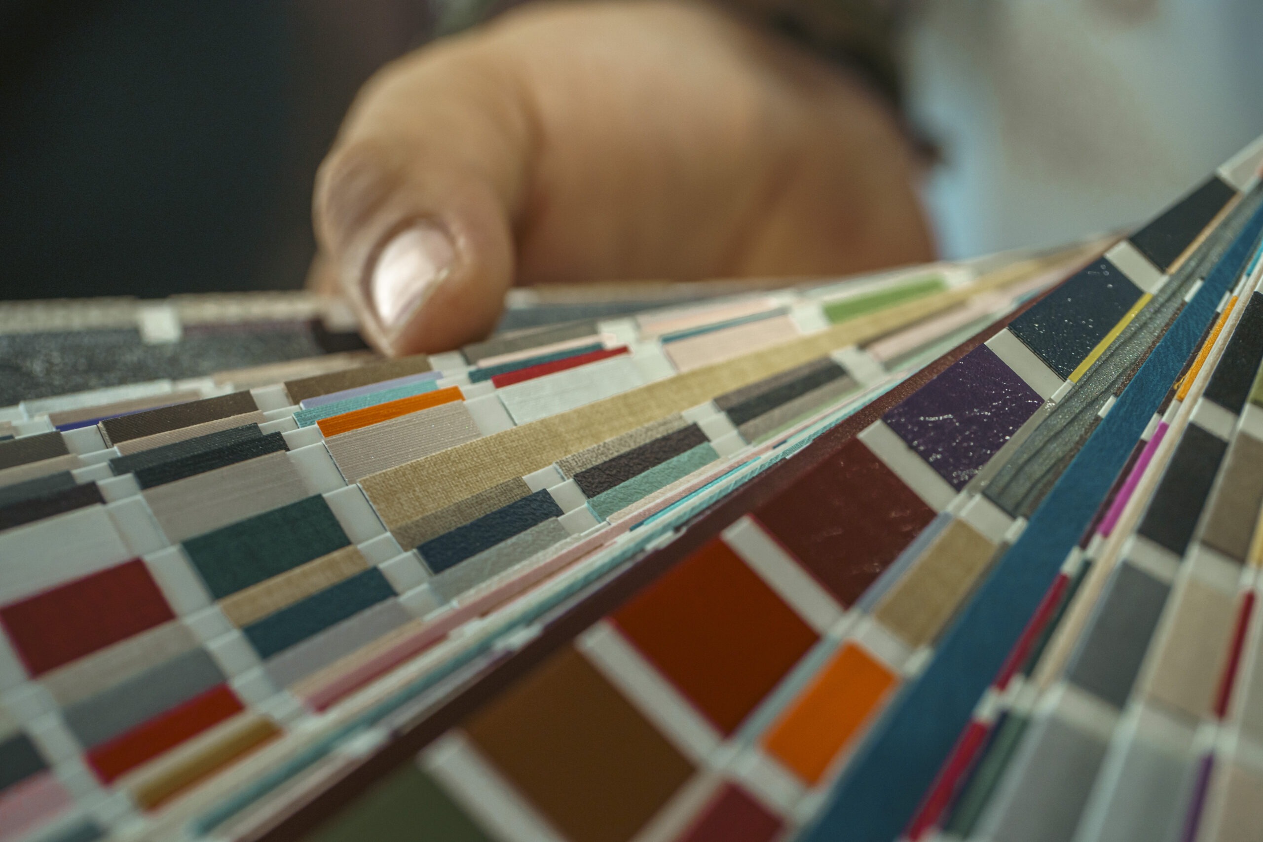
On the table, a sample takes up just a few centimeters. It has a distinct sheen, is viewed up close, and is almost always on its own. Then that same finish becomes the front of a counter, is incorporated into a wall unit, meets the glass of a display case, or extends along a wainscot. At that point, it changes.
To choose the materials for a jewelry store’s interior design , it’s not enough to simply ask which sample is the most beautiful. You need to understand what will happen when that material is scaled up, placed in a specific location, and surrounded by other elements. It is at this stage that an aesthetic choice becomes a design decision.
A finish changes when its surface area increases
The sample is useful. It allows you to observe color, texture, reflection, and surface quality. But it shows only a very small portion of what we’ll see in the store.
A highly distinctive finish may appear balanced on a sample but become overpowering when applied to a large surface. A subtle texture, on the other hand, may lose its impact as the viewing distance increases.
Whenever possible, it’s worth pairing the sample with a larger-scale representation: a mock-up, a prototype, a properly rendered image, or a previous project in which a comparable finish has already been used. This isn’t meant to replace the sample. It serves to restore the scale that the sample lacks.
The same material does not look the same under different lighting conditions
A finish does not have an appearance that is completely independent of its surroundings. Light alters reflections, contrasts, and perceived depth. A matte surface reacts differently than a more reflective one. A metal’s appearance changes depending on the direction of the light source.
In a jewelry store, this issue is even more critical because the material and the product share the same field of view. The choice of finishes should therefore be made in tandem with the lighting design—not before and not after.
The right material depends on where it is used
Saying that a material is suitable for a jewelry store doesn’t really mean much. Suitable where? On the display shelf of a showcase, on the front of a sales counter, on a wall, or on an item that is touched many times a day?
The location dictates the priorities. A surface viewed primarily from a distance may be chosen mainly for the way it creates volume. A detail close to the product requires greater attention to the visual relationship. An element subject to frequent use brings cleanliness, maintenance, and durability to the forefront.
Extra-clear crystal, burnished brass, satin-finished brass, PVD, matte lacquers, lacquered MDF, and veneers are all part of the technical vocabulary of D&sign jewelry. But their names alone do not determine the quality of the design. What matters is why that finish was chosen for that specific location.
The combination matters more than any single material.
In a real-world project, a single material rarely stands alone. Metal meets a lacquered surface. Glass reveals the display area. Wood paneling forms the backdrop of a display case. Floors, walls, and furnishings all come into view at the same time.
The focus should therefore shift from individual materials to the relationships between them. There is no single combination that can be applied automatically. There is a balance that must be assessed within the design.
The finishing touches continue even after the opening
A photograph of the newly completed store shows the material at its most controlled moment. Then comes actual use. Surfaces are touched, cleaned, and illuminated for many hours. Some areas receive more contact than others.
For this reason, the choice should also include a less “photographic” question: how do we want this surface to behave over time? This doesn’t mean always prioritizing the most durable material, but rather knowing where it will be placed and what maintenance will be compatible with its actual use.
A good collection of samples should spark questions
When looking at the materials, it’s tempting to make a quick selection. Before doing so, we prefer to check a few things:
- what actual surface area the finish will cover;
- from what distance it will be viewed;
- what materials it will be visually adjacent to;
- what kind of lighting it will be exposed to;
- how much it will be exposed to handling and cleaning;
- what role it will play in relation to the jewelry.
It’s not a ranking. It’s a filter. It allows you to rule out a finish that’s interesting in its own right but doesn’t quite fit that position, or to reconsider a solution that seemed more understated on the sample.
Precision begins with the initial meetings
Once the color palette has been defined, there remains a less visible step in the mood boards: figuring out how the materials will actually come together. An edge, a joint, a change in surface—the point where metal meets a lacquered section, the way glass is incorporated into the structure.
This is where in-house production in our workshops takes on concrete significance. The material chosen during the design phase must be translated into the finished piece while maintaining consistency with the intended design, proportions, and finishes.
For this reason, when evaluating materials and finishes, bringing samples to the D&sign showroom in Nuvolento a project reference, a pre-set color palette, or the materials chosen by the architect can be more helpful than starting with a general question about which finish to use.
The sample is still there, on the table. But now we know where it’s supposed to go.